XB week 17: drag and drop party
We matched last week’s record: again 26 MRs merged! :D
Experience Builder (XB) already had a hierarchy view for a while. Lauri worked with the Acquia UX team to change that to match the more common “layers” pattern (used in Photoshop and Figma). Harumi “hooroomoo” Jang made that a reality:
Issue #3458503, image by Harumi.
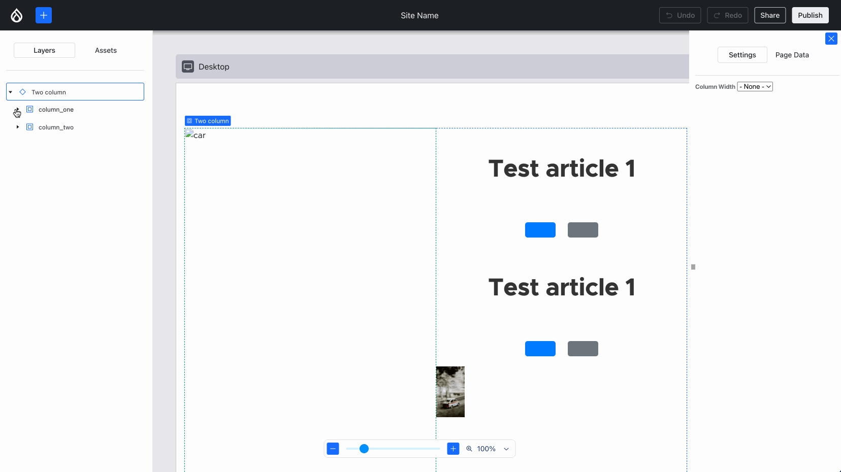
Ben “bnjmnm” Mullins and I (mostly Ben!) collaborated on integrating Media Library! This required expanding some of the lower-level XB infrastructure but most importantly, it means we proved Drupal core’s most complex field widget 1 can work, which is an important milestone:
alt updates, but the image won’t load — more about that later in this post :)
Issue #3454173, image by me.
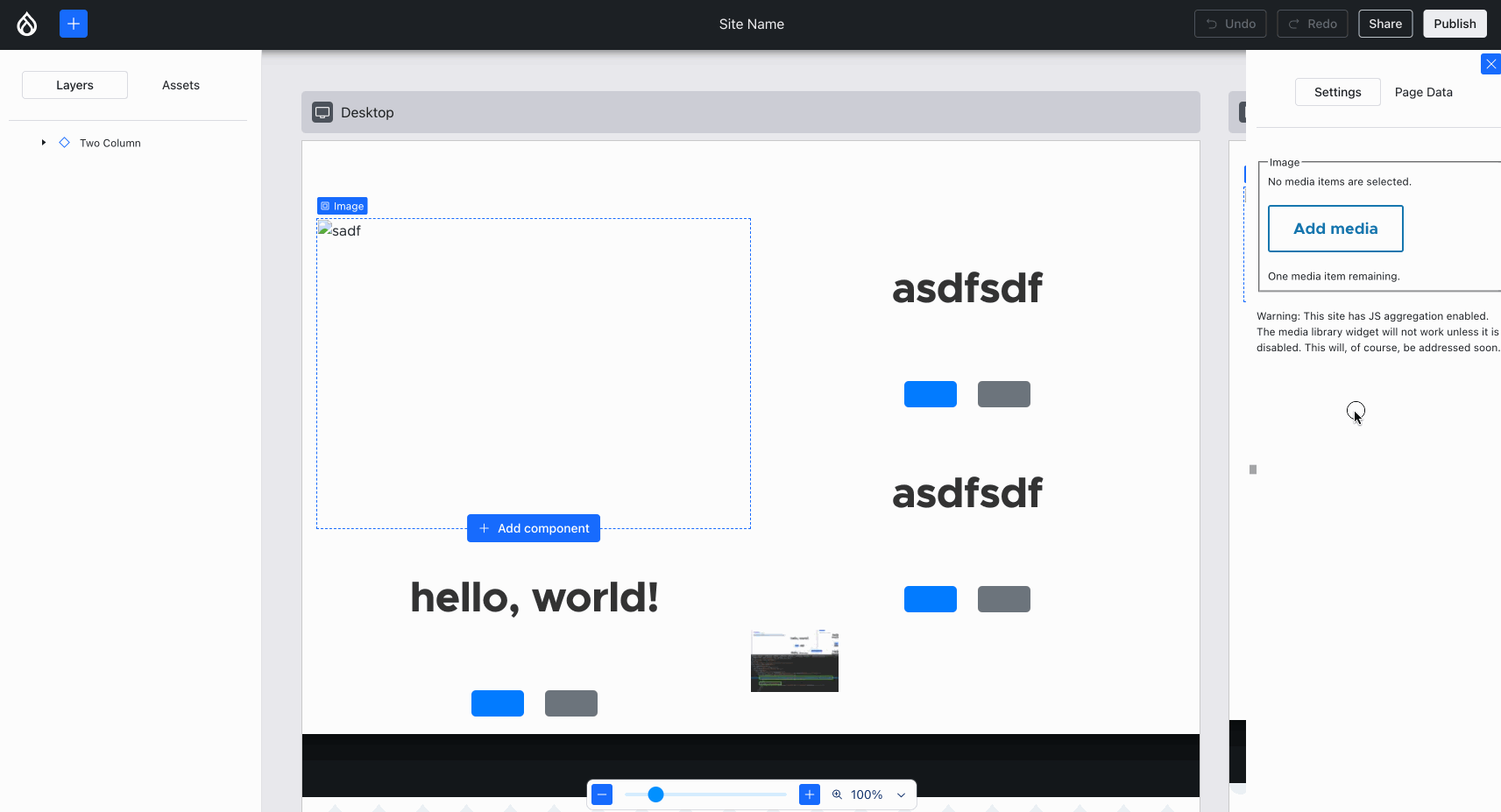
During the product research phase, Lauri identified that it’s important for Content Creators’ productivity to not have to craft the same combinations of components over and over again. Lauri and the Acquia UX team have labeled such combinations “sections” — similar to Layout Builder’s sections. Creating new ones is out-of-scope for 0.1.0, but conveying what that UX would feel like is in scope. So, Jesse “jessebaker” Baker and Bálint “balintbrews” Kléri worked on a client-only implementation that hardcodes a single section (again: for now):
alt updates, but the image won’t load — more about that later in this post :)
Issue #3463300, image by me.
It takes no designer or expert user to observe that in the above images, the drag-and-drop UX and visualization can be improved. The Figma designs do not have an answer for this. But … we have Bálint! :D He thought, tinkered, experimented and gave the Drupal ecosystem this delightful UX:
Issue #3470973, image by Bálint.
… which subsequently enabled him together with danielveza and Jesse to also highlight the slot that a component is about to be placed in:
Issue #3469822, image by Bálint.
If that isn’t an epic leap forward on the front end, then I don’t know what is! :D On so many fronts, dragging and dropping components became not only more usable, but also enjoyable.
It doesn’t end there, though:
- Utkarsh “utkarsh_33” updated the styling of text inputs, boolean toggle, etc to match the designs, by mapping more form elements to XB’s React components using the semi-coupled theme engine that Ben introduced in week 10
- Utkarsh, fazilitehreem and Jesse made deleting component instances more intuitive: you can delete the selected one using the keyboard now
- fazilitehreem, Utkarsh and Jesse added right-click support to the selected component
- Jesse fixed a crucial bug that prevented slots in freshly dropped components from working
Back end
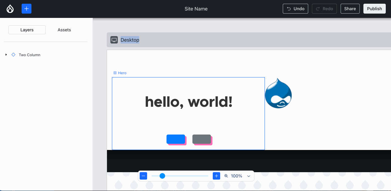
Comparatively, the back end progress this week was very non-visual… with one exception: Ted “tedbow” Bowman and I fixed the visually broken “image” components — this was caused by the buggy PoC code I wrote 14 weeks ago — finally this rose to the top of the priorities!
Issue #3469436, image by me.
Feliksas “f.mazeikis” Mazeikis and I discovered a critical bug in the auto-generated Component config entities for Single-Directory Components (SDCs) meeting the criteria: the field type and widget for optional props were missing. How could this happen? Because we’ve been racing ahead to make functionality exist, without the foundations being sufficiently thoroughly checked: the Component config entity’s schema is littered with @todos for adding more validation constraints. One of those would’ve prevented this problem … so we fixed not only the problem at hand, but also ensured that it could never reoccur, by introducing a KeyForEverySdcProp validation constraint first, and then fixing the auto-generation logic.
Dave “longwave” Long, Lee “larowlan” Rowlands and Deepak “deepakkm” Mishra updated XB to declare a runtime rather than development dependency on justinrainbow/json-schema — this is what the SDC subsystem uses to validate that the provided props values are considered acceptable by an SDC, and that’s why XB uses it to validate an XB field is valid (i.e. every SDC in the component tree must be renderable and hence trigger no exceptions for provided SDC props values). So that should’ve been marked as an explicit dependency months ago, but we didn’t spot that. Easy enough!
However … Lee pointed out that this is actually unacceptable for Drupal sites that use JSON:API in production, because it causes automatic validation for every JSON:API response against the JSON:API spec if assertions are enabled. That results in a significant performance regression. That being said, having assertions enabled is also a violation of Drupal best practices (and PHP best practices). Still, Drupal should help users even when they ignore/are unaware of best practices, so the XB module warns on the status report when best practices are violated. A core issue was created to improve this upstream: #3472008.
What a week! :D
Week 17 was September 2–8, 2024.
-
For now, that Media Library dialog looks rather stark, because it is, well … using the Stark theme. We plan to load the Claro/Gin styles, but to ensure style isolation, that requires some non-trivial
<iframe>shenanigans in #3471978 to avoid loading that CSS/JS in the context of the XB React app. ↩︎
Comments
All this is so awesome i have no words for it not only in english but even in my native. Thank you all and keep up the good job!
That’s what we were aiming for, thanks for letting us know it’s starting to work! :D